Introduction
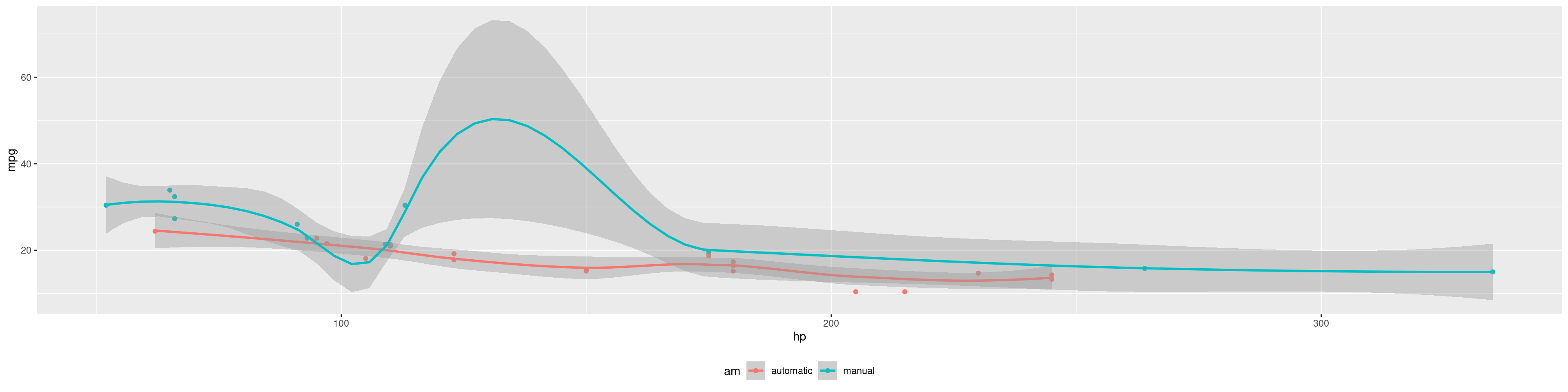
Images and graphics play an integral role in Tufte’s work. To place figures in the margin you can use the Quarto chunk option column: margin. For example:
library(ggplot2)
mtcars2 <- mtcars
mtcars2$am <- factor(
  mtcars$am, labels = c('automatic', 'manual')
)
ggplot(mtcars2, aes(hp, mpg, color = am)) +
  geom_point() + geom_smooth() +
  theme(legend.position = 'bottom')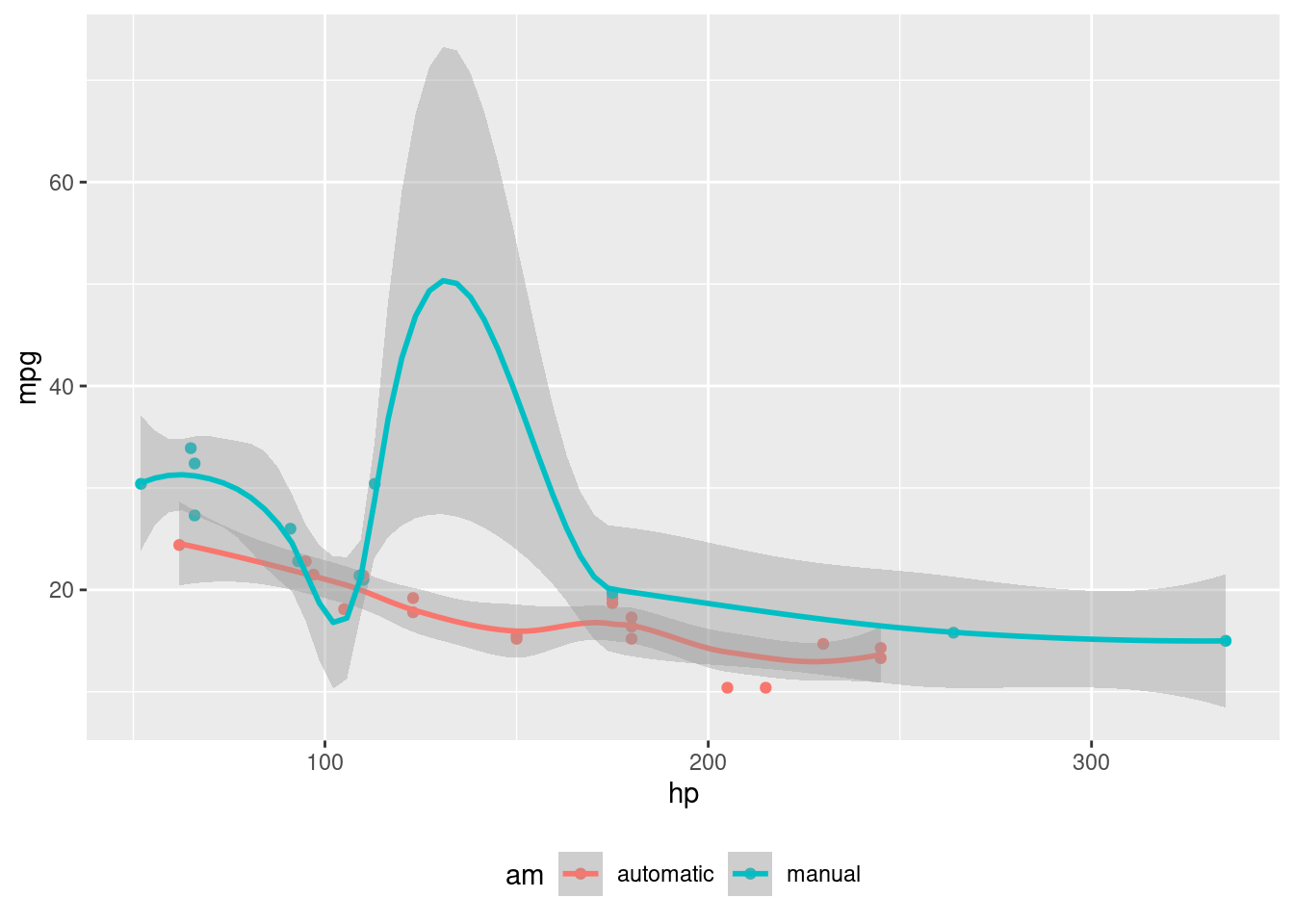
Note the use of the fig-cap chunk option to provide a figure caption. You can adjust the proportions of figures using the fig-width and fig-height chunk options. These are specified in inches, and will be automatically scaled down to fit within the handout margin.
library(ggplot2)
mtcars2 <- mtcars
mtcars2$am <- factor(
  mtcars$am, labels = c('automatic', 'manual')
)
ggplot(mtcars2, aes(hp, mpg, color = am)) +
  geom_point() + geom_smooth() +
  theme(legend.position = 'bottom')