library(ggplot2)

ggplot(airquality, aes(Temp, Ozone)) +
  geom_point() +
  geom_smooth(method = "loess")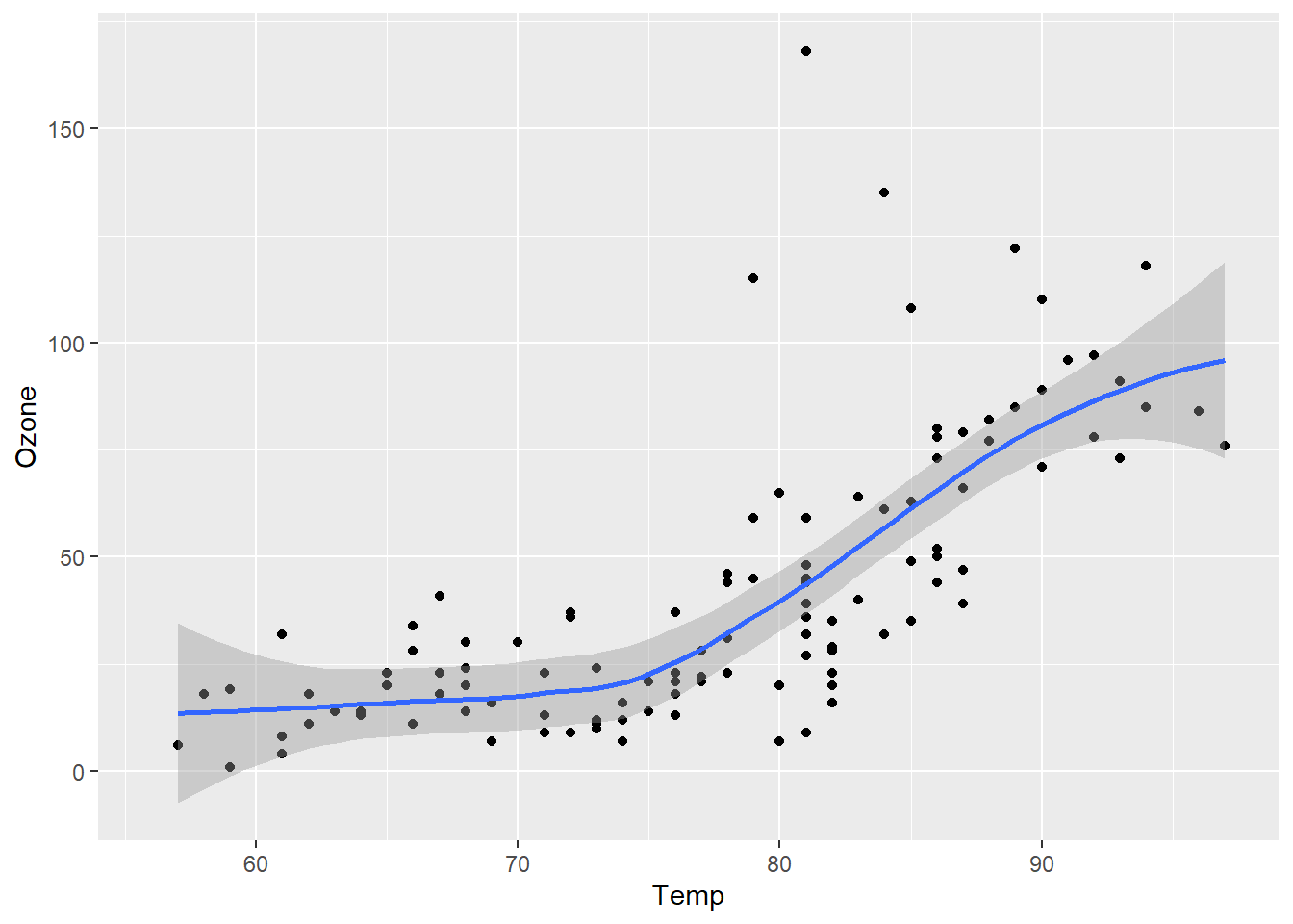
Simple example of using R snippets to show a chart.
This ggplot example is built from the quarto documentation.
Figure 1 further explores the impact of temperature on ozone level.
library(ggplot2)
ggplot(airquality, aes(Temp, Ozone)) +
geom_point() +
geom_smooth(method = "loess")
The sample blog template also comes with a simple R system addition test.
1 + 1[1] 2